What to include on your vehicle signage: The dos and don'ts
Share
Your vehicle signage should always include your brand name, what you do and how to contact you, such as your contact details.
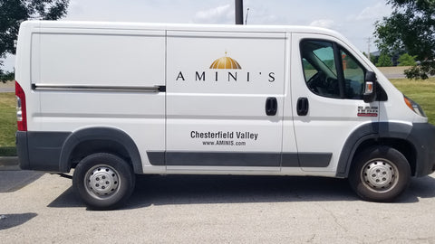
It's incredible how many people forget the 2nd part - to say what you do! This is a perfect example:
In today's fast-paced world, effective advertising is essential for businesses to make their mark and capture the attention of potential customers. One creative and impactful method of advertising is through vehicle signs.
Vehicle graphics are a powerful way to showcase your brand, services, and products while on the move. However, just like any other form of marketing, there are certain dos and don'ts that you need to keep in mind. In this article, we'll explore the key elements to include on your vehicle wrap, the things you should avoid, the various types of vehicle graphics, their benefits, design tips, and some inspiring car signage ideas.
What to include on vehicle signage
- Brand name & logo: Your company logo and business name are the most crucial elements of your vehicle signage. They should be prominently displayed and easily readable.
- Contact information: Include essential contact details such as phone number, website, and social media handles. Make it convenient for potential customers to reach out to you.
- Services or products: Highlight the primary services or products you offer. Use concise and compelling language to convey what sets your business apart.
- Tagline or slogan: A catchy tagline can leave a lasting impression. It should be memorable and reflect your brand's values.
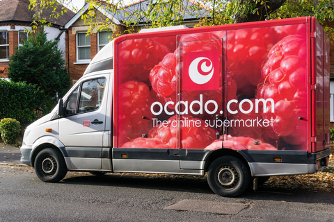
- High-quality imagery: Incorporate eye-catching images that represent your offerings. High-resolution visuals can make a significant impact.
What not to include on your vehicle
- Excessive information: Avoid cluttering your vehicle signage with too much text. Keep the message concise and easy to digest.
- Tiny fonts: Ensure all text is legible, even from a distance. Avoid using small fonts that are difficult to read.
- Controversial content: Steer clear of controversial or offensive content that could alienate future customers.
- Outdated information: Regularly update your vehicle signage to reflect current offerings and contact details.
Here is a great example of bad vehicle graphics

What are vehicle graphics?
Vehicle graphics are a form of visual communication that involves applying vinyl decals or wraps to vehicles. They can range from simple logos and contact details to elaborate full-vehicle wraps that completely transform the appearance of your vehicle.
Different ways to brand your vehicle
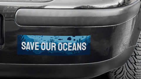
Bumper stickers: A bumper sticker is a small, durable sticker that's designed to be stuck to your car, truck or van's bumper to communicate a message. Here is an example of a bumper sticker:
Window stickers: A window sticker is a special sticker designed to stick on either the inside or outside of a car window. Often used for memberships, car passes and a myriad of other uses. Here is an example of a car window sticker:

Vinyl transfers: These are individually cut-out letters or logos applied directly to the vehicle's surface. Usually cut from single coloured vinyl and built up to create multi-coloured graphics. Here is an example:

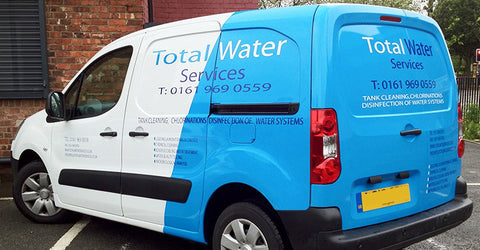
Partial wraps: Partial wraps cover a significant portion of the vehicle and include colourful designs and images. Here is an example:
Full wraps: Full wraps cover a vehicle's exterior, offering a large canvas for creative and impactful designs. These are the most expensive but look awesome. Here's a good example:
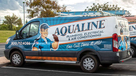
Magnetic signage: Magnetic signs are perfect for temporary branding applications as they're removable. Here is an example of magnetic vehicle signs:

Not all the options mentioned above are best for branding your vehicle to raise awareness of your business. Bumper & window stickers, along with other types of car stickers, are only small, so they have limited impact. We recommend sticking to the larger part or full wrap.
The benefits of vehicle graphics
- Mobile advertising: Your vehicle becomes a moving billboard, reaching a broad audience wherever you go.
- Cost-effective: Vehicle graphics offer a cost-effective advertising method compared to traditional methods.
- Local targeting: You can strategically drive your vehicle in areas where your target audience is more likely to be present.
- Non-intrusive: Unlike some forms of advertising, branded graphics on a vehicle don't interrupt or annoy future customers.
Tips for designing your vehicle graphics
Prioritise readability: Choose fonts and colours that ensure easy readability, even from a distance.
Consistent branding: Maintain consistency with your brand's colour scheme, fonts, and overall aesthetic.
Less is more: Keep the design clean and uncluttered, focusing on essential information.
Use high-quality images: If you incorporate images, ensure they are high-resolution and relevant to your business.
5 examples of bad designs for vehicles
While effective vehicle signage can leave a lasting positive impression, a poorly executed design can have the opposite effect, potentially harming your brand image and failing to capture the desired attention.
Here are some examples of bad designs and hilarious fails for vehicles that serve as cautionary tales:
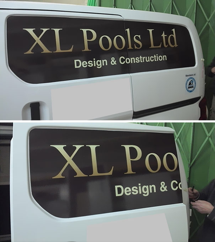
This van needed to be thought through!
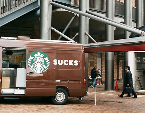
I'm sure Starbucks don't appreciate pictures like this travelling around the internet
This van with a sliding door says it all
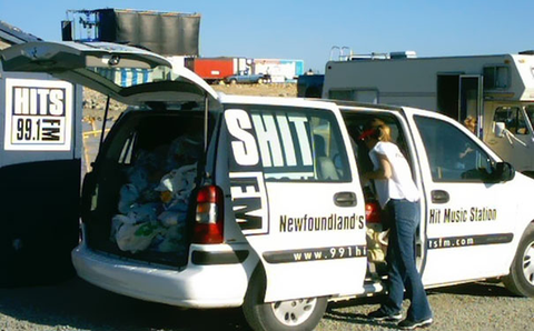
Even a large coach company can't get it right!

This Fiat pizza delivery car has an unfortunate placement

Learning from these design blunders can help you avoid common pitfalls and ensure your vehicle signage delivers a powerful, compelling message that drives your brand forward.
Conclusion
Vehicle wraps, van signage, clever vehicle graphic, company vehicle lettering, or other types of branding are dynamic and impactful ways to promote your business and leave a lasting impression on potential customers.
In the advertising world, where every second counts and every impression matters, vehicle wraps emerge as a dynamic and versatile tool to showcase your brand, captivate potential customers, and drive your business forward. As we've explored the dos and don'ts of crafting an impactful vehicle wrap, it's clear that the devil lies in the details. Every element plays a crucial role in conveying your brand's identity, from the strategic inclusion of your company logo, contact details, and a concise message to the subtle art of avoiding information overload.
Remember, your vehicle wrap isn't just a label on wheels; it's a moving canvas that tells your business name and its story to a broad audience. It's an opportunity to make a memorable first impression, pique curiosity, and inspire action. Adhering to readability, consistency, and simplicity can transform your vehicle into a powerful marketing asset that effortlessly spreads the word about your offerings.
However, as we've also seen through cautionary examples of bad vehicle advertising, the path to effective vehicle wraps is lined with potential pitfalls. Avoiding cluttered chaos, minuscule text, pixelated graphics, irrelevant imagery, and chaotic colour palettes is essential to ensure your message gets understood in translation.
As you embark on your journey to design exceptional company vehicles, embrace this medium's creativity as part of your wider marketing campaigns. Whether you opt for vinyl decals that exude elegance, a partial wrap that hints at your brand's charisma, or full wraps that envelop your vehicle in a captivating narrative, each choice contributes to your brand's visual identity.
In a world where attention spans are fleeting, and impressions are formed instantly, the art of company vehicle wraps demands your attention and intention. So, carefully curate your design, select the perfect call-to-action, include your company name, and watch your brand confidently travel the streets, leaving a trail of intrigued onlookers and potential customers in its wake. Your vehicle isn't just a mode of transportation; it's a moving testament to your brand's values, offerings, and aspirations. Craft it carefully, and let it become a remarkable embodiment of your business's identity.